


Fight!
Special Edition Book Edition

Sometimes, you buy a lot of books. Sometimes, you buy a lot of special edition books. Sometimes, you realize that you’ve inadvertently bought two editions of the same book from two different special edition book companies.
I’m speaking purely hypothetically, of course. Couldn’t be me.
Narrator voice: It was, in fact, her.
So what’s a gal to do when you get two of the same book? Compare them in a fight to the death of course!1
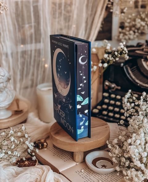
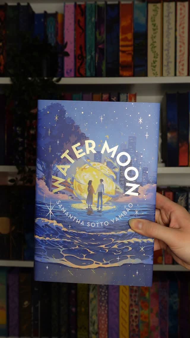
This purely hypothetical, did not happen at all™️ scenario happened to me in January. The book in question is Water Moon by Samantha Sotto Yambao. The book boxes in question are the Owlcrate Adult edition, and the Illumicrate regular monthly box edition.2 Yes, that Illumicrate that I said I probably wasn’t going to ever get anything from again that one time. I should learn before making pronouncements of any sort, but alas, I do not.

Water Moon is about a young woman who inherits her father’s pawnshop, only to find her father missing and the shop burgled on her first day as owner. We then follow owner Hana as she tries to track down her father. The catch? Hana’s pawnshop is the entrance to another world, one that only a few people can find in this alternate universe Tokyo.
What of the actual book itself? It was fine. The premise was great, and the worldbuilding details were very imaginative. However, there were a lot of structural issues in both the worldbuilding and logic of the book itself, and the romance was way too quick. I’d say it was a 4/10 if I was to give it a rating. There were definitely some enjoyable moments, and I liked the Japanese cultural references.3 But ultimately the structural problems this book had make me unable to rate it much higher, or recommend it sadly. We’re not here to talk about the plot itself, though. We are here to judge its aesthetic sensibilities.
Why get special edition books? To stave off the increasing creep of mortality, of course! I jest, but in all seriousness: why buy anything? Art is always in the eye of the beholder, and people like what they like. While this may seem like a new phenomenon, humans have been making fancy books for thousands of years. The Book of Kells, and Illuminated manuscripts anyone? What started as solely clerical and liturgical documents eventually moved into the secular space. These books were obviously very expensive to make and own, and for the most part, only royalty or the very wealthy did. It was revolutionary when books were able to be printed in a more streamlined type face and set, meaning there was now a greater reach for the written word. With the invention of the printing press, books didn’t need to be painstakingly hand lettered. In France, whose history I’m most familiar with, Livre de Poche came into existence. Livre de poche most literally translates to ‘pocketbook’ but it’s the French term for paperback, and also one of the largest French language publishers. Why was it important that books were small and could fit in your pocket? That meant that the common masses now had more income to spend on books, and greater access to education. You could now also take books with you. Most families had a Bible in the Middle Ages and Renaissance, but those were often big, cumbersome and unwieldy. The fact that books were then made in a size easily transported helped spread not only ideas, but also knowledge. Our modern special edition books are combining two long standing historical printing traditions: artistic renderings of literature, and portable sizing.
Special edition books nowadays are often, but not always, reissues of classic books. Given the proliferation of different book boxes, this has started to shift to new releases, but many of the special editions that both Illumicrate, Owlcrate and others offer are books that have been in existence for a while. This means that books from authors’ backlists get a chance at finding a new audience, especially books from the late 90s and early 2000s that did not have as much exposure as they might have now with social media. This also means that artists get the chance to redesign covers, and also receive greater exposure. Almost every special edition I’ve seen has appropriately tagged and highlighted the artists involved. In sum, special editions can be a net good for authors, illustrators and consumers themselves.
I won’t pretend that there isn’t an ecological or environmental impact here (all that paper has to come from somewhere), but in the grand scheme of things, I say let people have the things they like. Special edition books are clearly one of the lesser evils of our modern age.4
Rhetorical question aside, why might someone want a special edition? I don’t claim to speak for all readers, but here are mine: I like things. I like pretty things. And I like books. Combining them all together is *chef’s kiss*. Many members of my book club also buy special editions for books they really like. This is what I started to do with The Winternight Trilogy. I just didn’t stop there. I also like some of the covers better! I hate to say it, but I do!! Some of the original covers (especially for many SFF releases) are very generic. Special edition covers include details directly from the books, which makes them more interesting to look at.
The rise in book boxes also means that, like anything in a capitalist market, there are a plethora of options. One of the ladies I follow on Instagram has an entire account dedicated to just keeping track of book boxes, their new releases, and upcoming special editions. Clearly, this is a serious business.
This is all to say – if you want special edition books, great. You do you. If you don’t want special edition books, also great. You do you. I’d encourage you to read all the same, but whether you do that on a kindle, iPad, a physical book or library book is none of my damn business.
Now, onto the books in question themselves.
We’re actually judging a book by its cover
There are a number of elements to examine when comparing modern special editions:
The dustjacket
The reverse dustjacket
The naked hardback
The edges
The endpaper art
The special bound in content
Because I’m a scientist (ha), we shall evaluate this criteria systematically.

First, the official promotional materials from the book boxes themselves, which include better photography than I can muster.
Now that you’ve had a chance to look at them, let’s discuss.
The dustjacket/cover
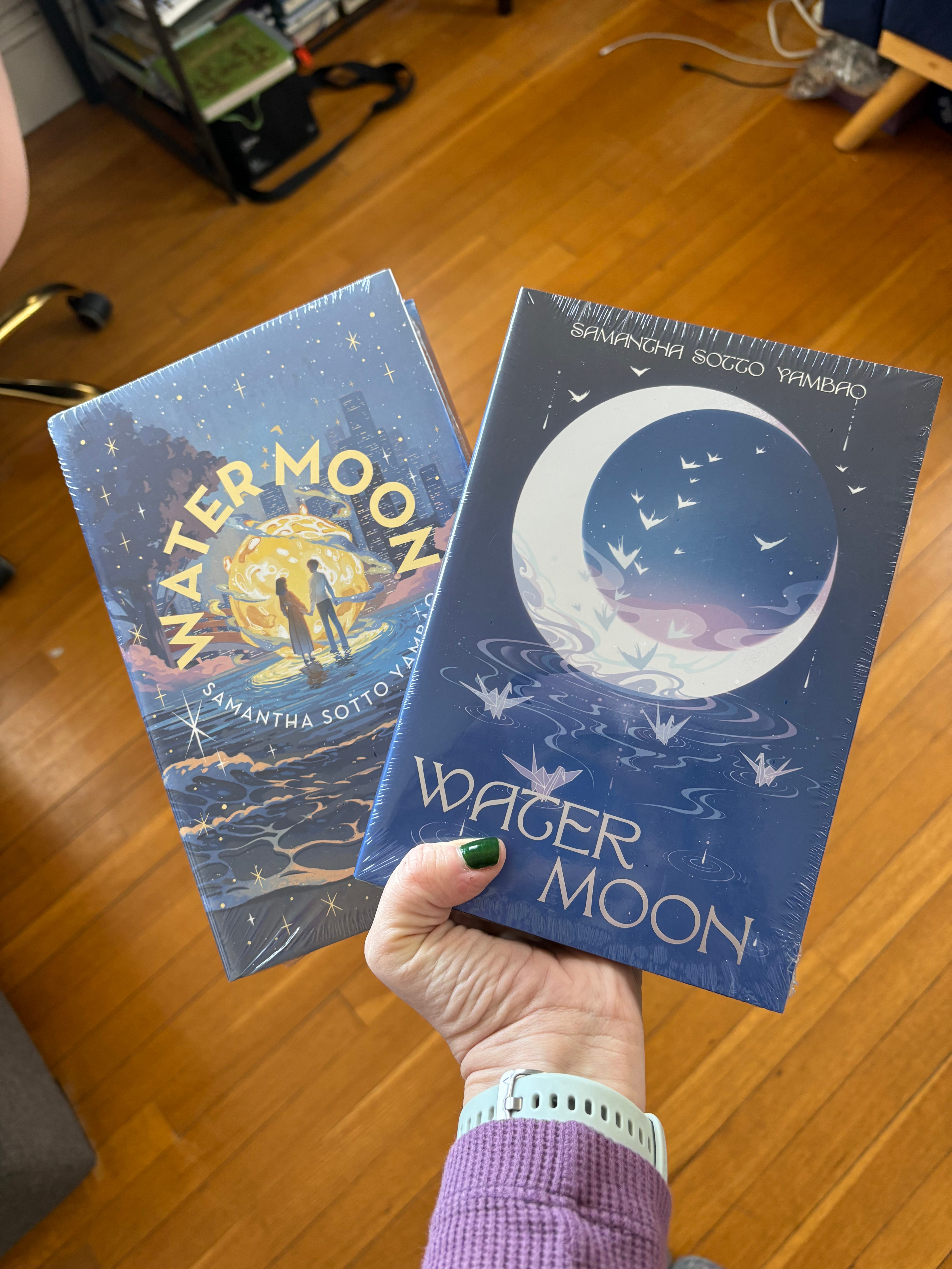
Of the two of these, I like the Owlcrate edition best. This is just my personal taste; I prefer the minimalism art. The book is called Water Moon, and the full moon plays an important role in the story, and here we have the moon front and center baby. The Owlcrate dustjacket was designed by Lillitt Wang.
The Illumicrate edition features more of the Tokyo setting and less emphasis on the moon (though the moon is still there!) It’s just two different styles of art. This one was designed by Jane Tibbetts, with illustration by Josee Shimazaki.
The win for me is the Owlcrate version. 1-0 Owlcrate.
The reverse dustjacket
The Owlcrate edition has one. Meaning, there is an illustration on the inside of the dustjacket. The Illumicrate edition does not, meaning the point on this one goes to Owlcrate by default.
2-0 Owlcrate, with reverse dustjacket design by Ben Stephen.
The naked hardback
Without the dustjacket, there are illustrations printed on the book itself. I found the Owlcrate style of art to be jarring compared to the cover design. The art by Shoko Ishida was still beautiful, but just not my preference. Illumicrate’s was designed by Danlin Zhang, and I really liked the muted colors and foil accents.
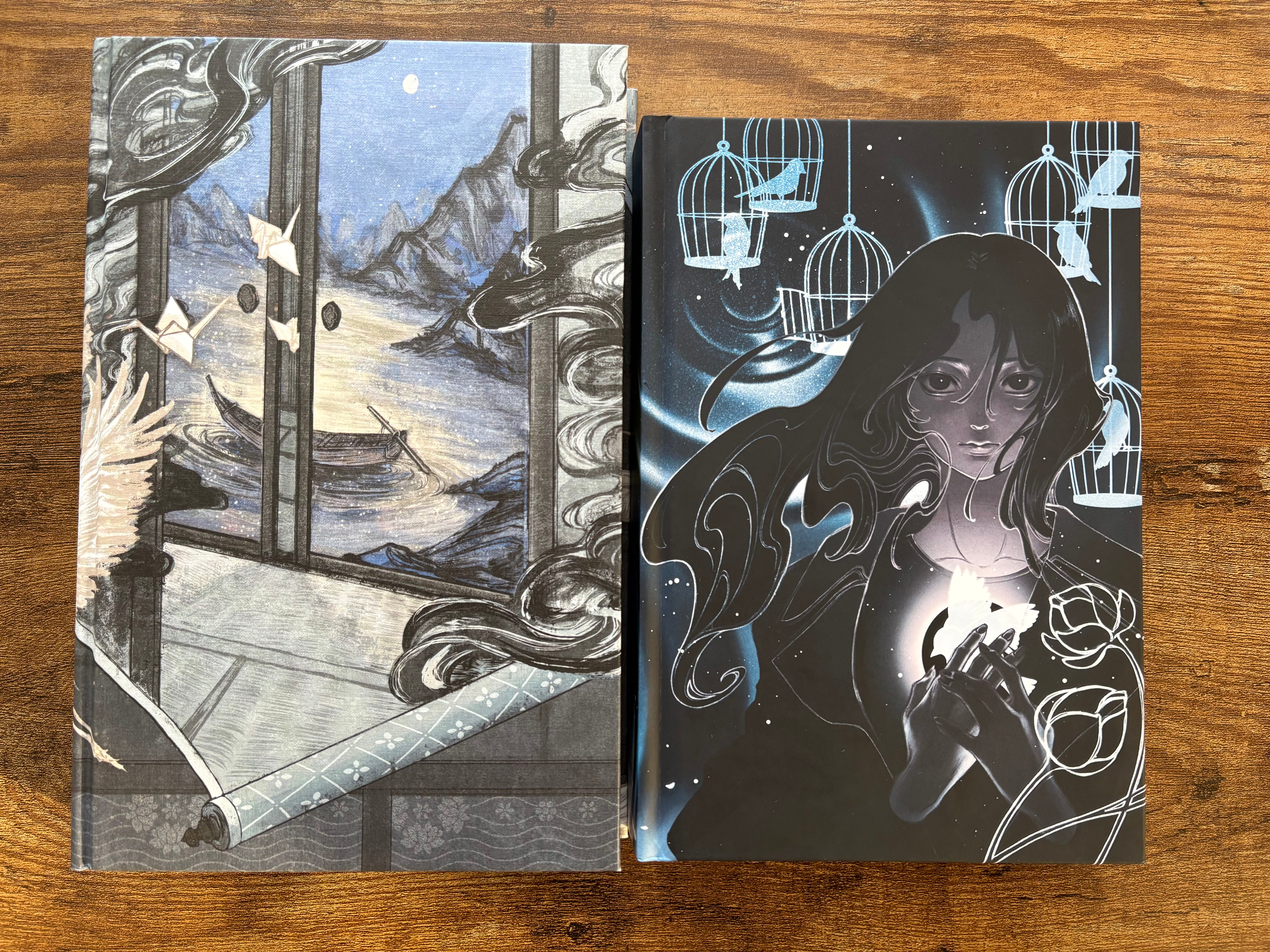
Overall, both hardback covers reminded me of anime, but I have to give the win to Illumicrate because I preferred their design. Plus the foil. Illumicrate is finally on the board. 2-1.
The edges
The edges are, well, the edges of the book. They will often feature designs connected to the details of the book themselves. Given the minimalism of the Owlcrate edition’s cover, I expected a bit more from the sprayed edges. These were once again designed by Lillitt Wang.
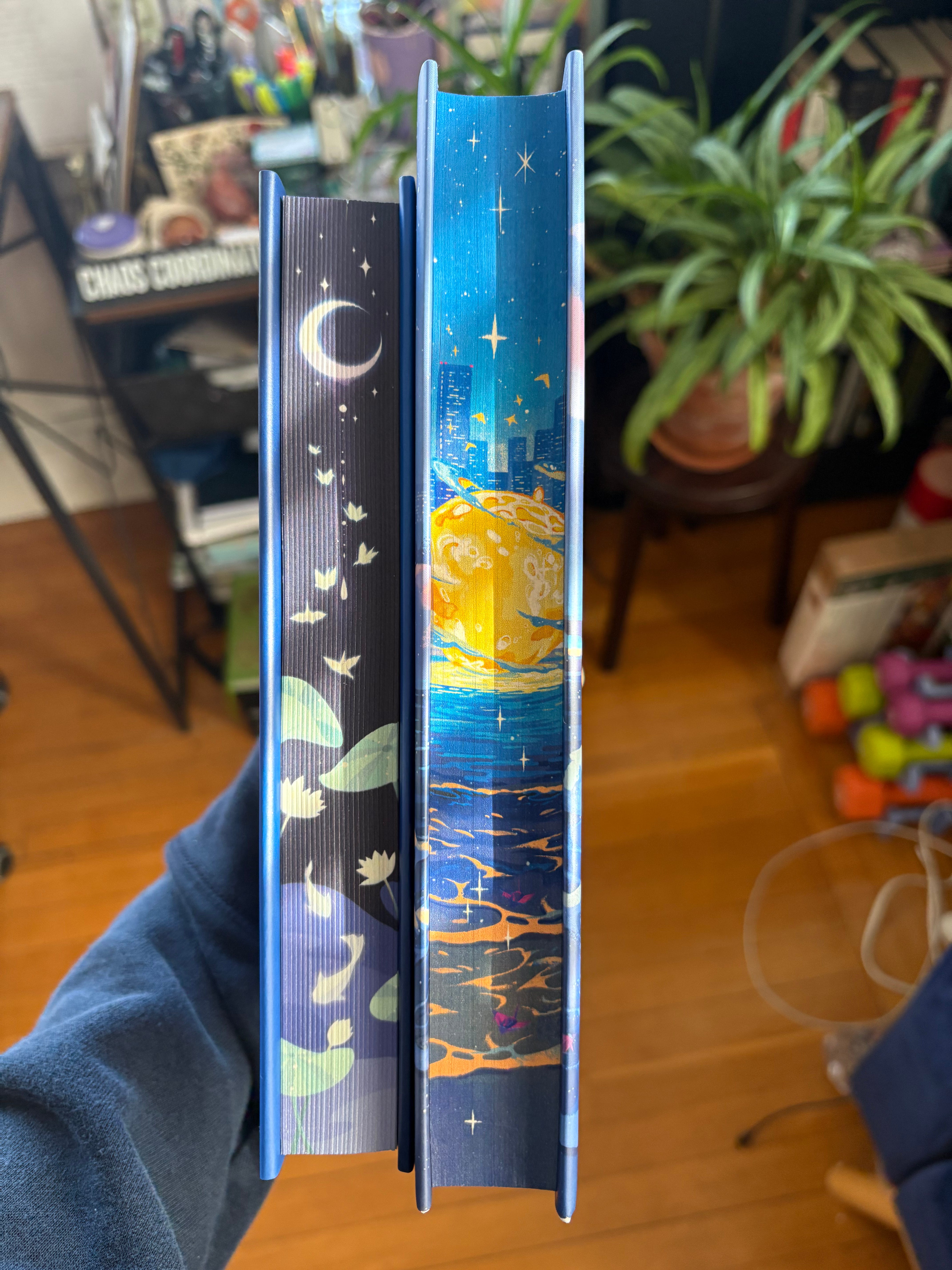
The Illumicrate version included main elements of the cover included on the edges, and I liked the minimalism of that compared to the busyness of the cover. There’s literally no rhyme or reason here, these are all my subjective opinions and preferences, so please don’t try too hard to discern any logic. Illumicrate’s sprayed edges were also designed by Josee Shimazaki.
We’re at a 2-2 tie now; onto the final categories.
The end paper art
End paper art appears on the inside of the covers of the book and first page. The Owlcrate papers were designed by ZSJUN, and the Illumicrate ones were designed by Hoàng Lập.


Once again, personal preference comes into play here. I liked the art style on the Illumicrate ones better, and they’re different from the front and back. The Owlcrate end papers were the same front and back. I am really splitting hairs here; this is what happens when you have two beautiful books designed by brilliant artists.
3-2 Illumicrate. Will Owlcrate come back? Or will Illumicrate take the crown?
Special bound in content
Special editions, to justify the price, which are more expensive than ‘regular’ paperbacks and hardbacks, often include special bound in content from the author. This is to help offset the cost; aside from the art, you are technically getting more out of the special edition.
The author note in the Owlcrate version from author Samantha Sotto Yambao appears to be in her handwriting. But the Illumicrate edition gives additional details on the genesis of the text. But! The Owlcrate has a QR code at the back that gives more special content online! And a painting! Gah, why Is this so hard? This means absolutely nothing and now I feel bad about hurting a book’s feelings?
Both editions are signed, so we are equal there.
In the end, I have to give the win to Owlcrate. The extra QR code included pictures from Yambao’s travels to Japan, which gave greater background on the book.
This means we have a 3-3 tie, which is silly because I am the one who curated these metrics and I could have made them an odd number, but why would I do that?
I guess I’d have to say that the Owlcrate version won because that was the edition of the book I ended up reading. Mainly because the book itself was smaller and I have finicky joints.
But in the end, I’m the winner because I have two beautiful editions of the same book. *bangs gavel*
No New Books™️ Challenge
There’s really no news to report here: I have bought no new books! I’d say this is an exercise in my growing discipline, but really I haven’t seen anything shiny to distract me and convince me to break my streak. I’ll take whatever wins I can get though.
Longest streak: 38 days (January 1st - February 6th)
Last streak: 6 days (February 27th - March 4th)
Current streak: 21 days (March 5th - Present)
Mug Moment of the Week
This week’s Mug Moment of the Week comes from Reductress. As in, the mug itself is from Reductress. If you’re not familiar with their work, they’re an online, satirical news source, à la The Onion. Their tagline is: Women’s News, Feminized. Here’s a recent sampling of their headlines:

Anyways, Reductress is great and I love them and they are also the source of my favorite hat.
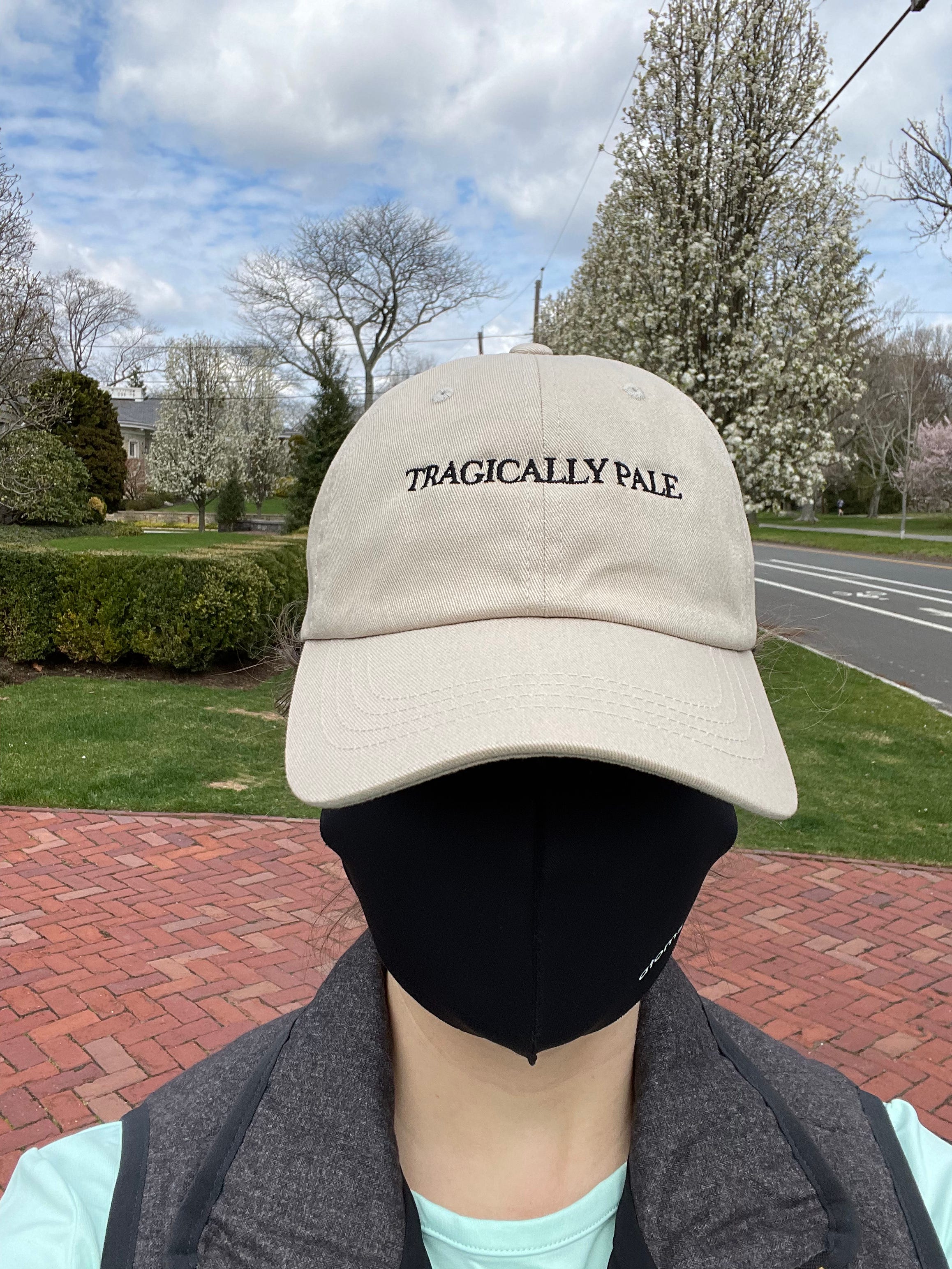
Storytime about this hat. But wait Marissa! you say. This is the Mug Moment of the Week! You shall get your mug shortly, I promise. But the hat!! The story is I bought this hat, then sent a picture to my brother. I am, literally and objectively, quite pale. I do not tan. It comes from my Slavic people (photographic evidence here), and as a child I was often asked if I was sick. I wasn’t, just pale.
So when I saw this hat for sale from Reductress, I immediately bought it. And then sent the photo to my brother. Who insisted on paying me back for it because he was laughing so hard and insisted that he buy it for me. (You can still buy this hat!)
Maybe I bought the below mug from Reductress with the hat? I can’t remember, but the snark is eternal. And the mug’s message was too on point. Behold:
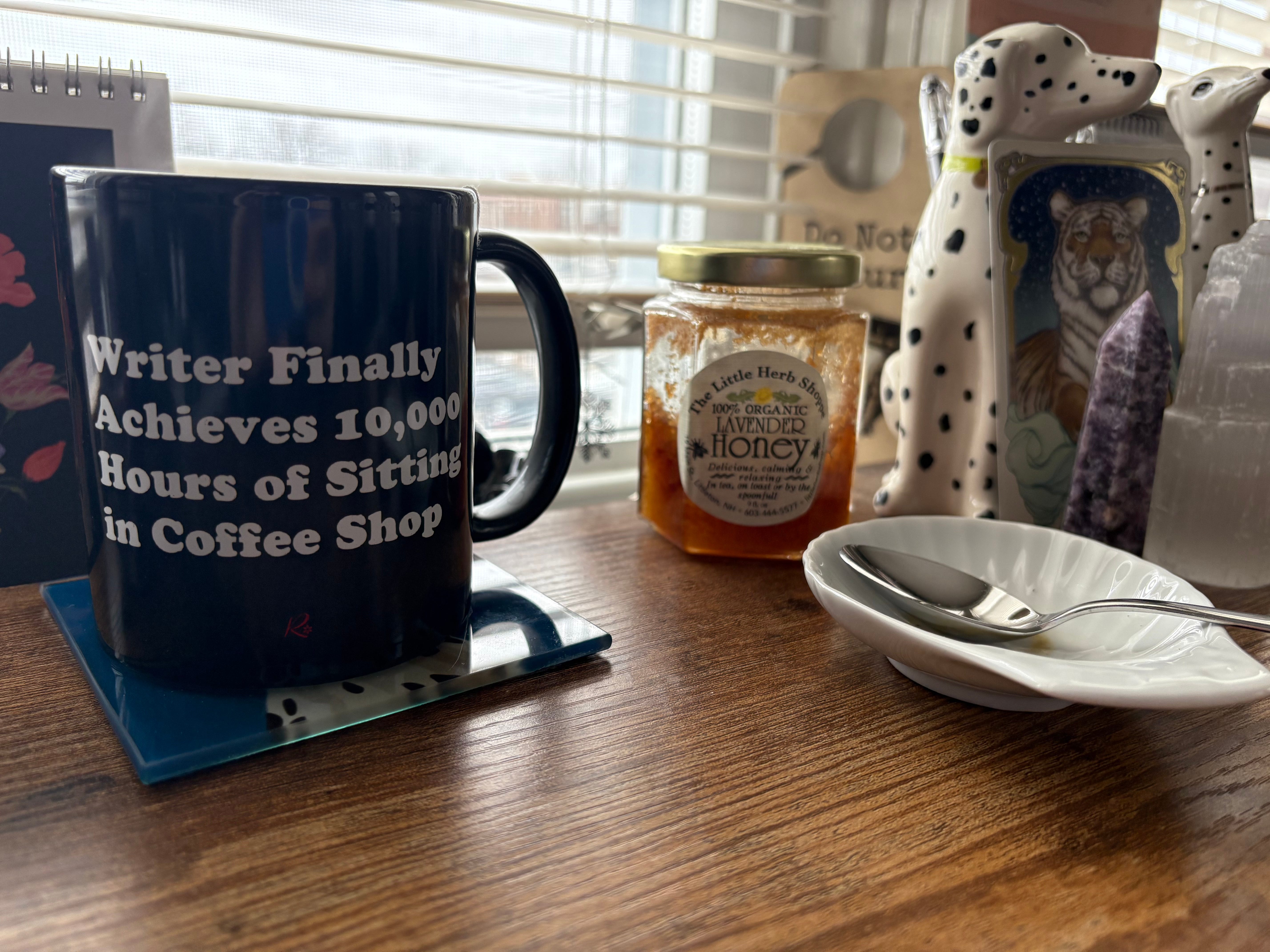
You know what? Some of us like sitting in coffee shops!!! Trying to write!!!
This is a normal sized coffee mug, which means that it does not often suit my needs. (I prefer the giant ones.) I am currently on a quest to use up a lot of the looseleaf tea and honey I have for no other reason than to use them up. Spring cleaning and all etc. The honey is from The Little Herb Shoppe in Littleton, New Hampshire. Very good, no notes.
Do you have any special edition books? Do you compare them to each other to see which one is prettiest? Tell me in the comments!
No books were harmed in the making of this post.
Don’t worry, payment for these was accounted for appropriately in my book buying breaks. I tend to buy them in quarterly installments if I do at all.
However, some reviews on Goodreads have pointed out the glaring cultural inaccuracies. I believe Yambao is Filipino, so this gets into a larger discussion about writing a culture not your own, and I am not qualified to have that here.
https://www.goodreads.com/review/show/7325941545
What I am qualified to say is that there is one extremely incorrect reference to the Titanic. That is the type of culture I can comment on.
I’d be remiss if I didn’t note that the proliferation of special editions means that lesser quality products have emerged as other non-book related companies (cough cough Target) try to cash in on this market. The recent Onyx Storm release was a victim of this: many people who bought the Target special edition took their qualms to TikTok to vent about the shoddy quality of the books.
Hilarious selfie, Marissa. Buying two of the same, authors must love you. You should expect a Christmas card, at least.